Release Date: 05/01/2015
NEW: Mobile-Friendly Responsive Website Design!!!
A mobile-friendly website is a website that displays correctly on hand-held devices such as smartphones, iPhones, iPads, and tablets. It also has these features:
We have put together a few great facts that everyone who has a website should know! Contact WebHornet today to convert your website to mobile-friendly!
What is a mobile-friendly website?
A mobile friendly website design has a specific layout and content based on the size of the viewing device. If you are using an iPhone the site will look different than on a desktop or tablet device. With a mobile friendly design, you will make sure that visitors are always getting the best user experience, no matter what device they are using.
But my website already works on a mobile screen!
Does it look the same on a Smartphone as on a desktop? Do you have to zoom to read text? Are links close together? Google will soon be cracking down if your website is not mobile-friendly. Remember that your user is most likely using his or hers thumb to navigate the website and not a cursor, which can in turn cause frustration resulting in the user leaving your website.
Google will penalize you!
Apart from potentially frustrating your customers and new users, Google is starting to punish website that aren’t user friendly. As time goes on, more and more website will be mobile friendly. If your website doesn’t keep up with other mobile friendly competitors, Google will start to rank them higher.
Upgrade to V3.0 is not included in the WebHornet monthly fee. If you want to discuss a Responsive Website for your business or organization, we are here to help! Contact us today to order your Responsive Website at support@webhornet.com or call us to discuss 402.391.1713.
![]()

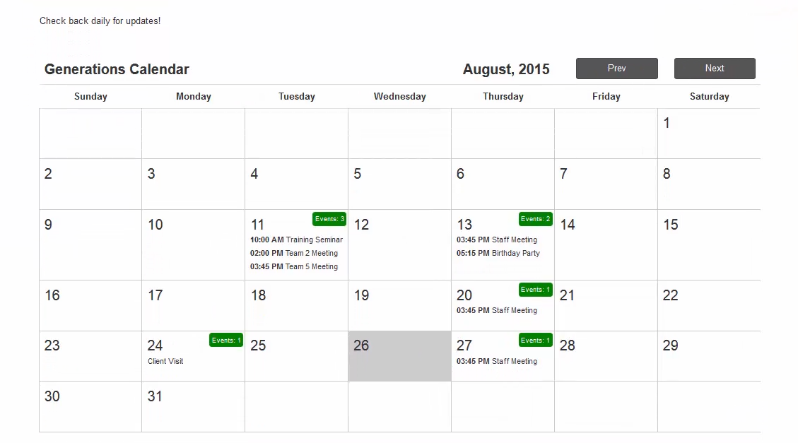
Normal view:

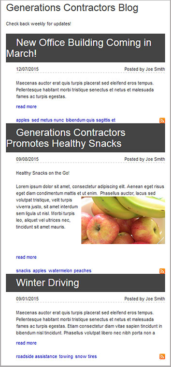
Mobile view:

Normal view:

Mobile view:


Having issues with the new WebHornet Release, contact support@webhornet.com.